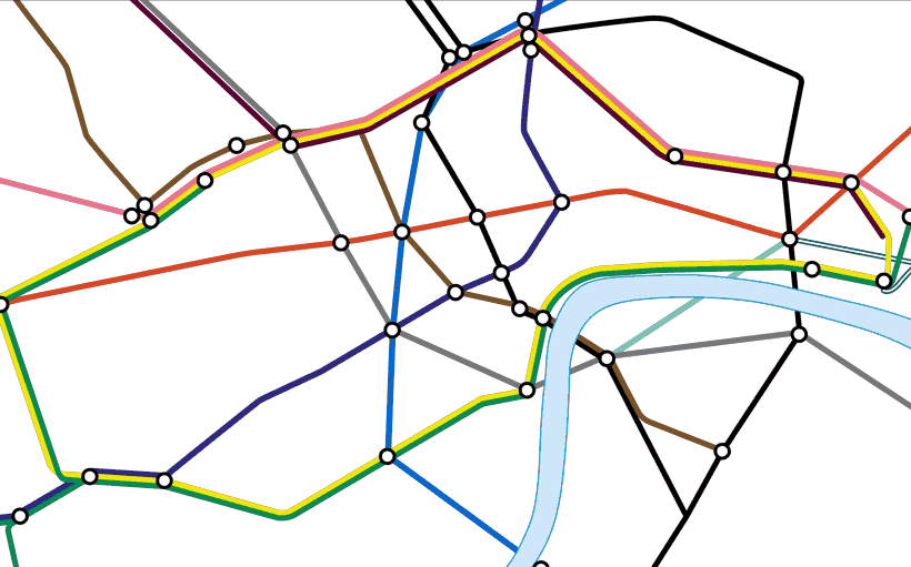
As a Londoner, when I picture my city, I see both the tube map and the EastEnders title sequence, but I have no idea of how they relate to each other. Looking at the map you’d think that Bayswater was miles from Queensway, and it’s not until you get on a bus or cycle around that you really see how it fits together.
The Real Underground is an interactive animation that allows you to see the tube map morph into a geographical map, and view a street map underneath. It can be a startling experience to see the city change shape before your eyes. You can also view the current map morph into Harry Beck’s 1933 original, to see how the design has changed since the original.

Designed for TfL (Transport for London), the Real Underground featured in university courses and academic papers and books on cartography. Unfortunately it was built in Adobe Flash which was deprecated at the end of 2020, and so I have taken it down. I plan to make an HTML 5 version and will add it as soon as it’s out.
No one would suggest we go back to a geographical map, but we forget there are many different ways in which we could map the Underground. We may have lost a sense of what’s on the ground by too slavishly sticking to Beck’s strict design rules.
Below I look at the history of the Underground map, from a geographical muddle, to an iconic clean design, and then at the growing range of designers who have tried to make a better tube map.
Mind the Map
The first tube maps showed the tube overlaying a street map, with parks and landmarks. But as more lines were added, and the network stretched into the suburbs, it became impossible to display everything clearly.

This 1921 map was the first to remove all street level information, and just show the tube system. The design is clean, but central London still appears crowded.
An electrical engineer, Harry Beck’s idea was to draw the map like a circuit diagram. In his iconic 1933 map, all lines were drawn at 45° and distances in the wider network were shrunk. By including the River Thames, the map feels grounded. The schematic design made it easier to see central London: it was an instant success, and has inspired hundreds of similar designs all over the world.
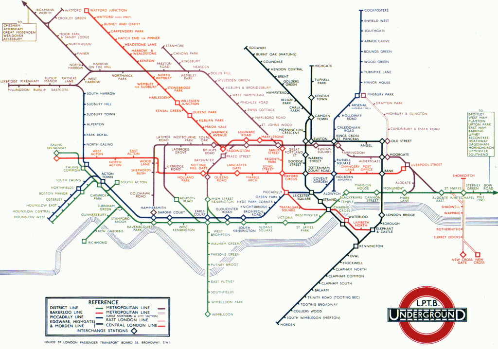
The map has been tinkered with ever since, but by 1951, most of the design decisions had been fixed, with the map panning out from the Central Line running straight through the middle, and the Northern Line running vertically.
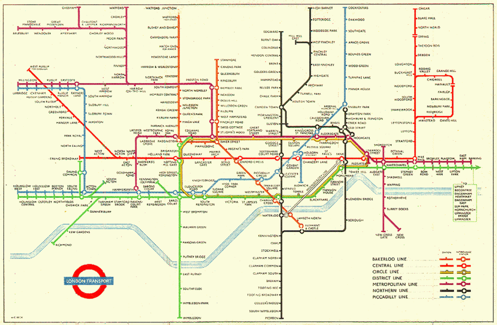
By 1971, the Victoria Line had been added, and the Circle Line had taken on the bottle shape.
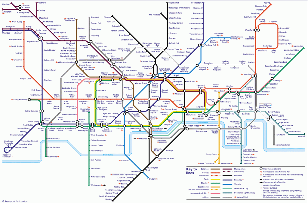
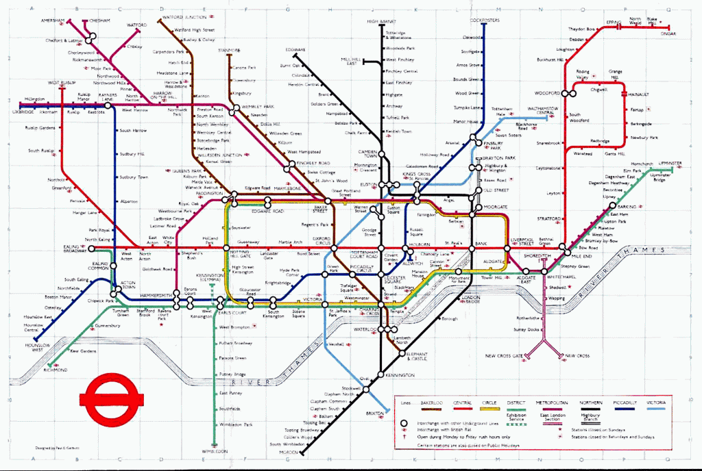
In this 2009 map, the design remains unchanged except for the addition of the Piccadilly Line’s Heathrow extension, the DLR, the North London Line, and the Jubilee extension.
Better than Beck?
The desire to create a better tube map has become something of an obsession for a growing number of designers. The problem is best summarised by showing the updated version of the 1921 map – a geographical tube map.
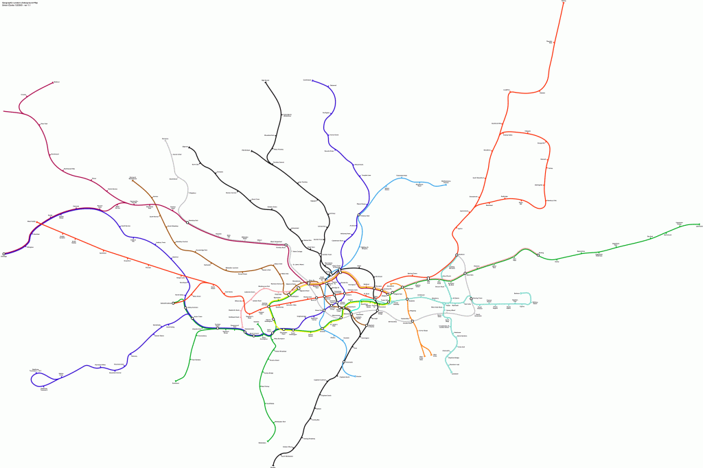
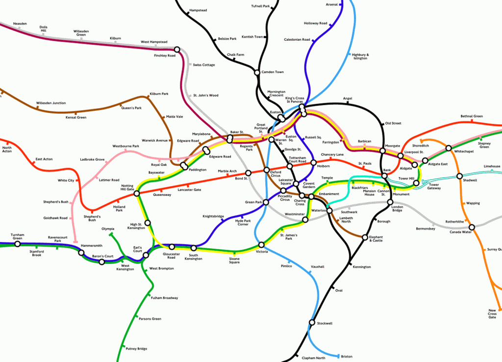
When you zoom in on the central section it becomes clearer, but it’s surprising how foreign a real tube map looks.
Cartogropher Max Roberts has used Beck’s map as an inspiration and tinkered with the design rules to try to come up with a better map.
Beck’s primary rule is that the lines can only go in 45° increments, allowing a total of 4 different axes. The map above is even more strict, allowing only 3 axes, but it’s still pleasing to look at and marginally more geographically accurate.
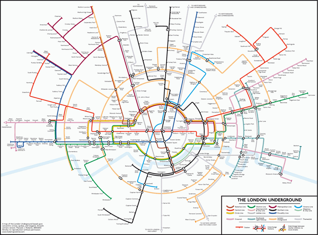
Roberts’ Circles map is arguably the most beautiful to look at, but it doesn’t solve all the geographical problems.

The Curvy map allows the designer more flexibility, and is more geographically accurate, but it makes me feel slightly giddy.
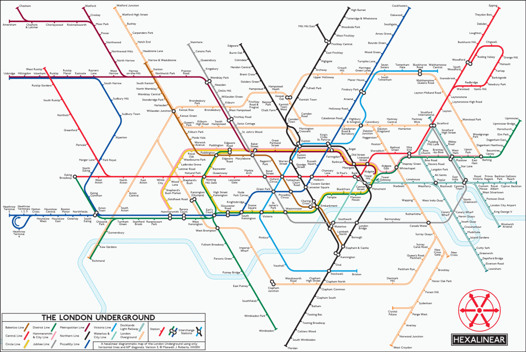
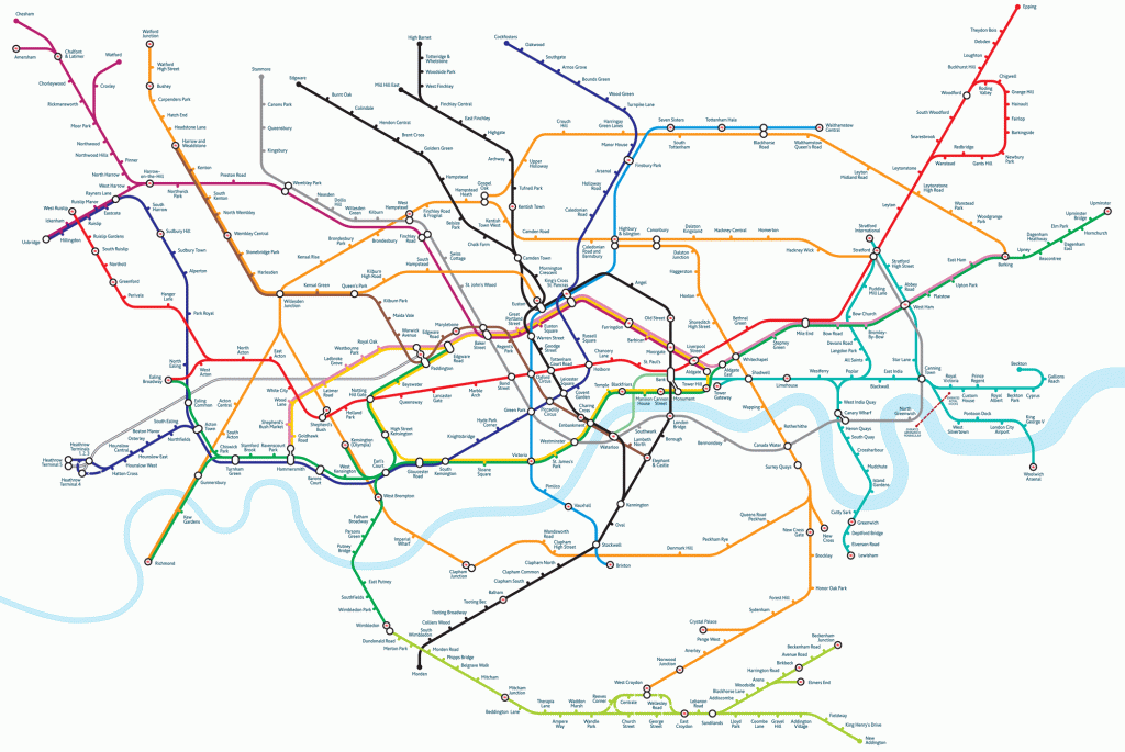
While Beck’s original design only allowed lines on 4 axes, with lines at 45° and 90° this map uses lines drawn at 30°, 60° and 90° for a total of 6 axes. The result is Roberts’ most geographically accurate map, but the result takes the focus away from the centre.
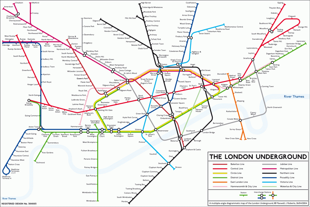
Using 45° angles, Peter Saxton’s map keeps to Beck’s rules, but is more geographically accurate.
Mark Noad’s map breaks the 45° rule, with straight lines drawn at any angle. For the first time in a hundred years, Central London is shown geographically, while the suburbs are compressed. It’s a pleasing compromise and the one I would most like to carry in my back pocket.
More Tube Maps
- Max Roberts circular, hexalinear, and curvy subway designs from all over the world – check out his NY subway maps
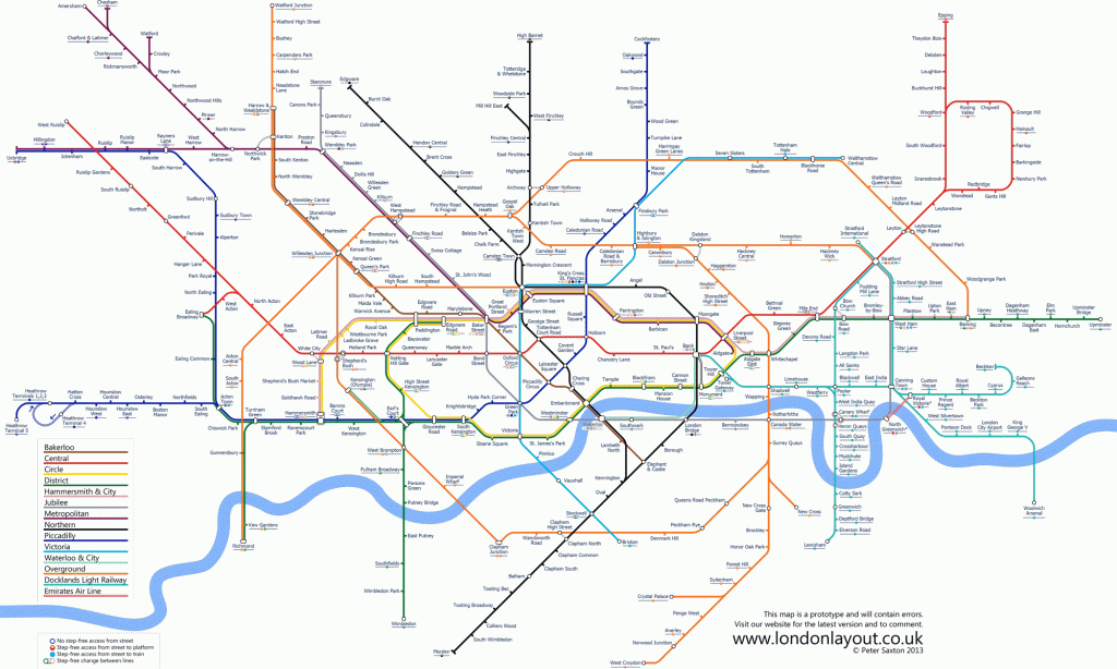
- Mark Noad’s map is geographical in the centre, but stylised further out
- Peter Saxton’s map is a neat compromise between schematic and geography
- Jug Cerovic and Luke Carvill are two more designers who have made new versions of the tube map
- Oskar Lin’s map was painstakingly moulded from string, to create a design that was both schematic, and in proportion to the distance between each station
- Mapping London is an archive of a huge range of London maps including the purist’s dream, an up-to-date tube map using Harry Beck’s original design
- Londonist has an entire section on maps, with a wide selection of alternative tube maps including the Cool Britannia artsy Great Bear, and even a bizarre spiral tube map. You’ll also find a London Salary Map, a Future Tube map, and a Brutally Honest map of London-stereotypes all here
- Walkers and environmentalists will enjoy this Beck-inspired map of London’s green spaces
- London tube map archive is a comprehensive collection of tube maps since 1908
- Going Underground is an appealingly obsessive Underground blog
- Transport for London has not only tube maps, but also bus, cycle and walking maps